
Designing Sephora’s iOS “Book a Service” Flow
Sephora sought to enhance its mobile booking experience for beauty services by redesigning the “Book a Service” user flow within their iOS app. The goal was to align the updated flow with both iOS Human Interface Guidelines and Sephora’s internal SMUI (Sephora Mobile UI) standards, ensuring a smooth, intuitive, and visually cohesive experience for users.
Deliverables
iOS Mobile App Design
Timeline
12 Weeks
Client
Sephora
Role
Product Designer
Enhancing mobile beauty booking through thoughtful, platform-specific design!
The Problem.
The existing “Book a Service” flow in the Sephora app was not fully optimized for iOS, leading to minor usability issues and inconsistencies with Sephora’s internal design system. The booking experience needed to feel more intuitive, polished, and aligned with the expectations of iOS users while maintaining brand integrity.
The Solution.
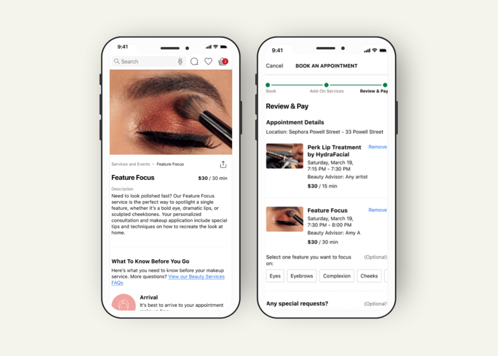
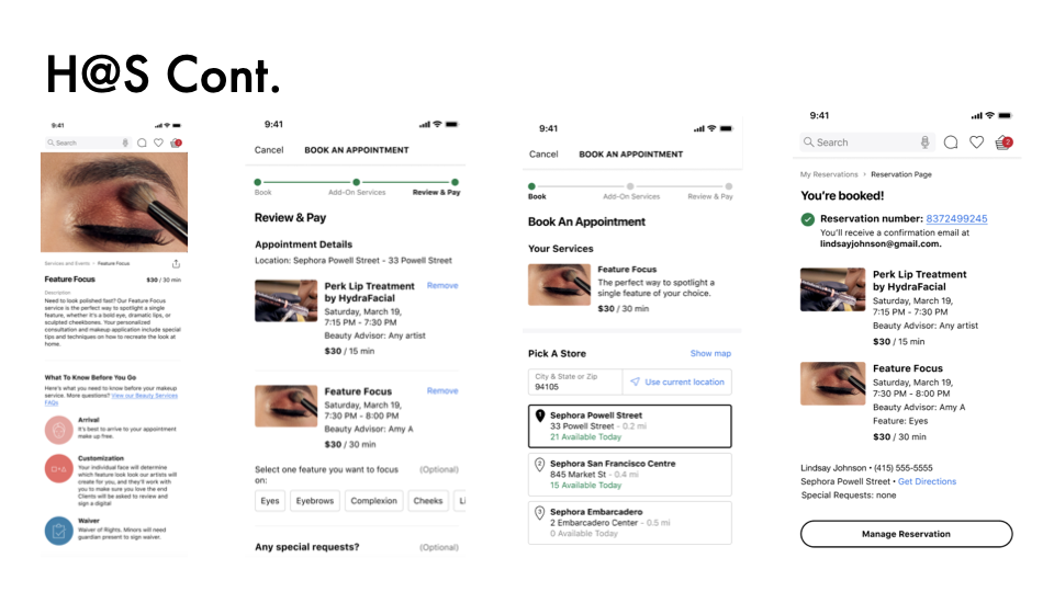
Redesign the entire “Book a Service” flow within Sephora’s iOS app, adhering to the SMUI guidelines while incorporating iOS platform best practices. Focus on improving flow clarity, interface consistency, and user confidence throughout the booking process.
Project Process
Research & Platform Review
I began by studying the existing SMUI design system, Apple’s iOS Human Interface Guidelines (HIG), and Sephora’s current app flow. I identified inconsistencies between SMUI standards and iOS expectations that could cause user friction.
Define
Key problem areas were mapped:
- Misaligned iOS-specific UI patterns (such as navigation and form behavior)
- Minor inconsistencies in touch target sizing and button placements
- Opportunities to simplify steps and reduce decision fatigue during booking
Ideate
Using insights from the platform review, I sketched new versions of the booking flow:
- Streamlined the number of screens
- Improved information hierarchy
- Applied consistent button treatments, headers, and error states
- Focused on a “progressive disclosure” approach, revealing options only when needed
Prototype
I created low- and mid-fidelity wireframes based on the improved flow, validating each against both SMUI and iOS HIG standards. High-fidelity prototypes were built in Figma for internal design reviews.
Test
I regularly requested feedback from senior designers, engineers, and product managers at Sephora. Each iteration improved platform alignment and user clarity.
Responsive Designs
While primarily focused on iPhone layouts, designs were scalable to accommodate different screen sizes like iPhone SE, 13 Mini, 14 Plus, and Pro Max models.
Accessibility Considerations
- Button contrast and text size met WCAG guidelines
- VoiceOver and keyboard navigation were considered during interaction design
- Tap targets were appropriately sized for mobile touch gestures
Takeaways
Impact:
The redesigned booking flow provided a more consistent, platform-specific experience for Sephora’s mobile users. It improved usability, strengthened SMUI brand cohesion, and aligned the app more closely with iOS user expectations.
Quote from internal feedback:
“This flow feels so much smoother and cleaner . It feels like an app that’s built for iPhone users now.”
What I Learned:
This project sharpened my skills in platform-specific UX design, taught me the importance of adhering to both brand and platform guidelines simultaneously, and reinforced how micro-interactions and visual polish can drastically improve user trust and engagement.
