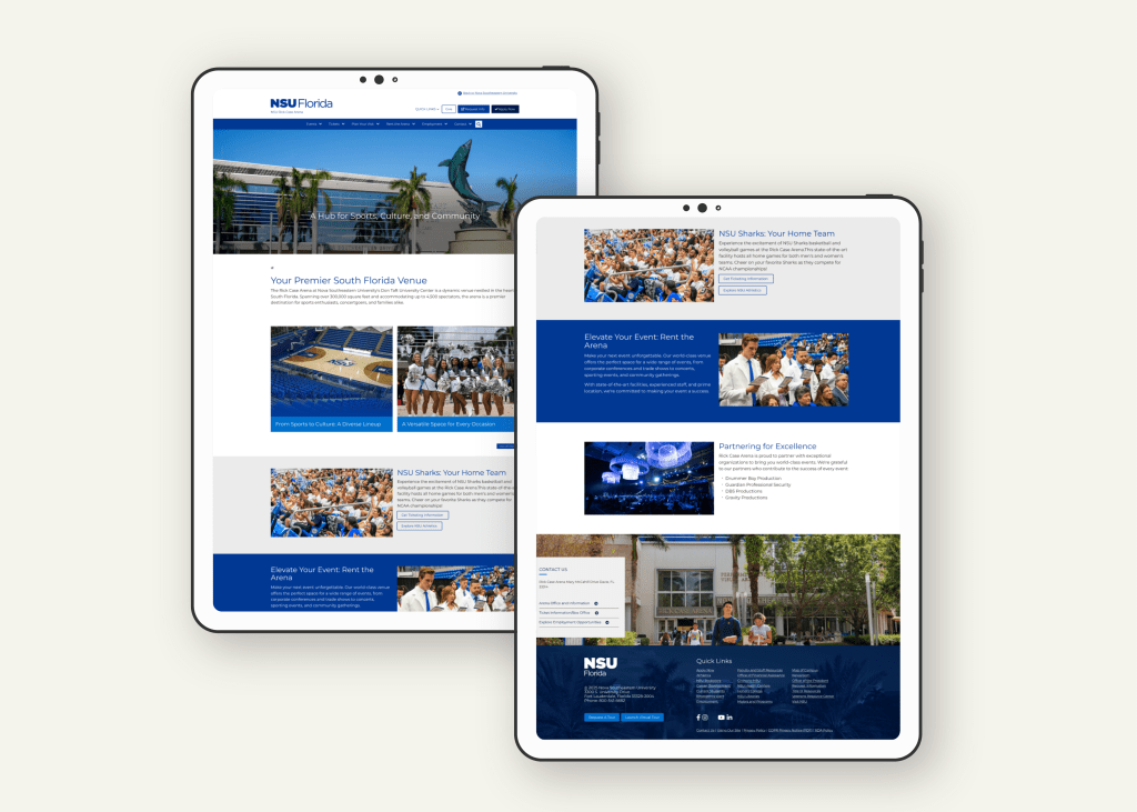
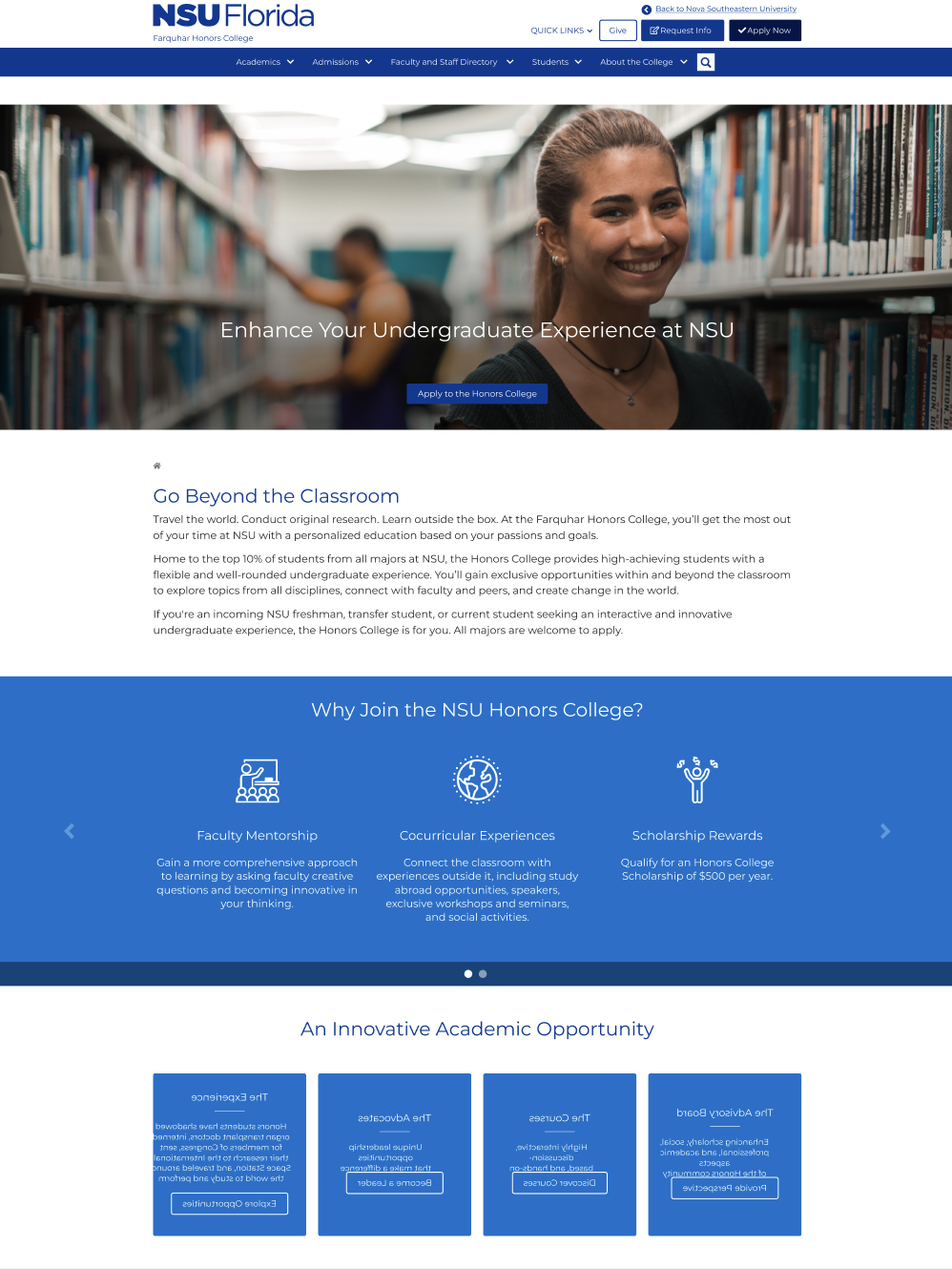
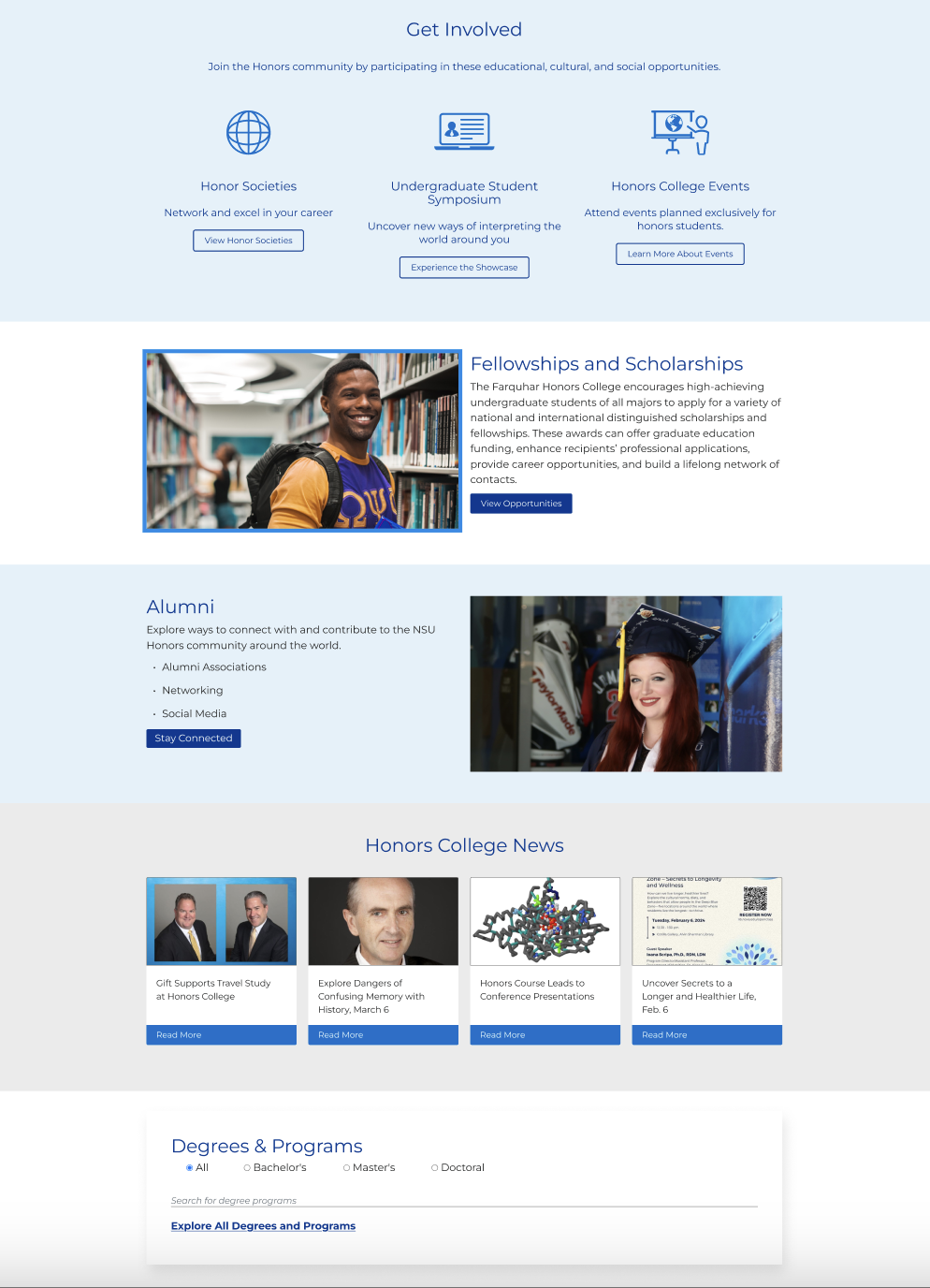
Redesigning Nova Southeastern University’s Department Websites
Nova Southeastern University (NSU) sought to improve the usability, consistency, and accessibility of its departmental websites. Their goal was to modernize the look and feel, streamline navigation, and better support the needs of prospective students, current students, faculty, and staff. I collaborated closely with internal teams to bring this vision to life while aligning with NSU’s brand identity and technical CMS capabilities.
Deliverables
Website Redesign (Desktop, Tablet, Mobile)
Timeline
3 months
Client
Nova Southeastern University
Role
UX Designer
Empowering users through strategic, accessible, and user-centered web design!
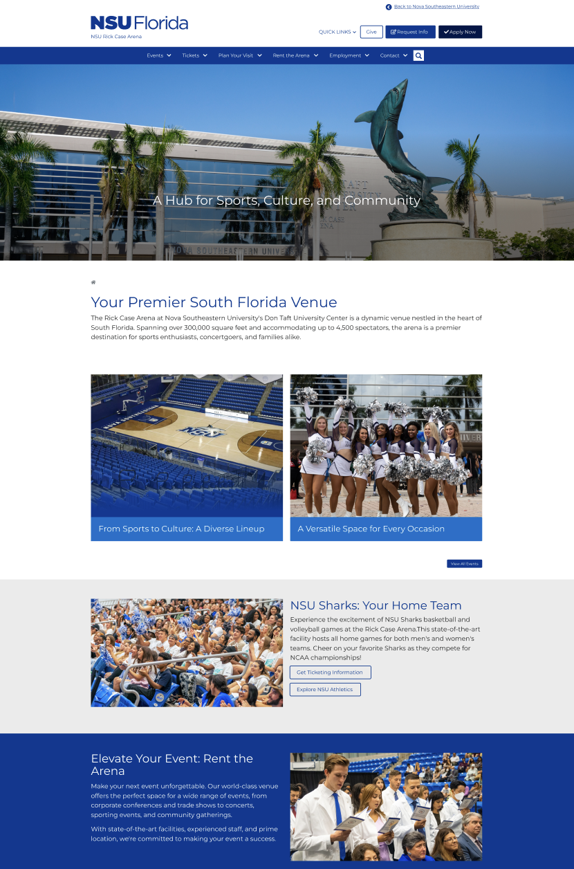
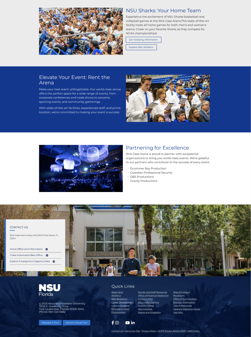
The Problem.
Nova’s departmental websites had inconsistent layouts, poor mobile responsiveness, and an outdated design that did not meet modern accessibility standards. Navigation was confusing, content was hard to find, and there was little visual cohesion across different sections, creating a disjointed user experience.
The Solution.
Redesign the department website templates to prioritize usability, mobile optimization, and accessibility. Streamline content organization, implement clear visual hierarchy, and ensure designs could be successfully implemented within the Omni CMS environment.
Project Process
Research & Empathize
I began by auditing the existing departmental sites, identifying major pain points around navigation, content layout, responsiveness, and accessibility. I reviewed user behavior analytics, conducted stakeholder interviews, and studied competitor universities for best practices.
Define
From the research, I formulated a clear problem statement: Users were struggling to efficiently navigate and engage with departmental content due to disorganization, outdated visuals, and lack of mobile optimization.
Ideate
Using insights from the research phase, I sketched new layout concepts focused on:
- Mobile-first responsiveness
- Simplified navigation
- Clear calls-to-action
- Consistent branding across departments
Prototype
Low-fidelity wireframes and mid-fidelity prototypes were created to explore new page structures, with special attention to accessibility and CMS compatibility. Key page types like homepages, department directories, and academic program pages were prioritized.
Test
I gathered feedback from university stakeholders, iterated on the designs, and refined the final versions based on input regarding visual style, content flow, and technical feasibility.
Competitive Analysis
I benchmarked Nova’s old website designs against other large universities known for strong digital experiences.
Key findings:
- Other institutions prioritized mobile experiences, resulting in better engagement.
- Consistent branding strengthened user trust.
- Clear program search features improved conversion rates.
These insights helped guide design decisions and set performance benchmarks for Nova’s redesign.
Universities
A
- Strengths:
- Highly organized navigation with clear program search tools
- Mobile-first design providing excellent responsiveness across devices
- Prominent CTAs for “Apply Now,” “Request Information,” and “Visit Campus” above the fold
- Strong use of storytelling through student success stories and videos
- Areas for Improvement:
- Some pages felt dense with text, making scanning difficult on mobile
- Search functionality could be more dynamic with predictive search features
B
- Strengths:
- Visually striking homepage with high-quality imagery and branded consistency
- Simple, intuitive main menu with limited options, reducing decision fatigue
- Focused user paths tailored separately for prospective students, current students, and alumni
- Strong accessibility adherence, particularly in color contrast and font sizing
- Areas for Improvement:
- Internal department pages lacked consistency compared to main pages
- Some user flows, such as application processes, were multi-click and could be streamlined
C
- Stengths:
- Excellent balance between dynamic visuals and clear content hierarchy
- Modular design system allowing flexibility across academic and administrative departments
- Strong community engagement through news, events, and research highlights prominently featured
- Search and filtering tools well integrated into academic and departmental pages
- Areas for Improvement:
Some microsites and individual program pages still showed slight variations in branding- Complex research portals occasionally overwhelmed first-time users without proper signposting
- Complex research portals occasionally overwhelmed first-time users without proper signposting
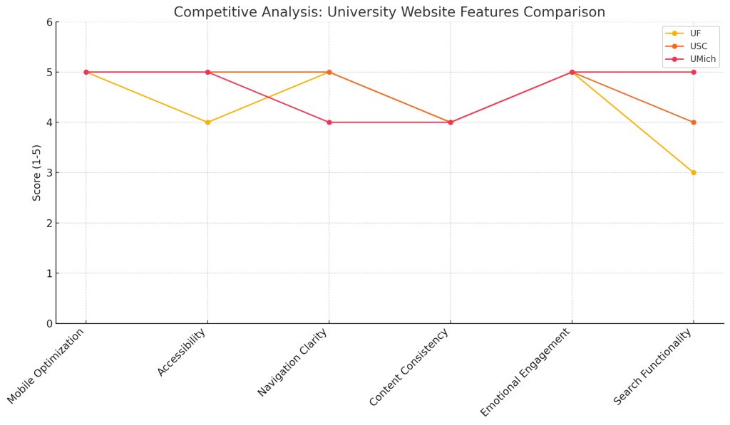
Key Takeaways for Nova
- Simplify main navigation to prioritize prospective student journeys
- Create consistent templates that departments can easily adopt while maintaining branding
- Ensure mobile responsiveness and visual hierarchy to enhance scannability
- Focus on accessibility early by incorporating WCAG 2.1 AA standards across all layouts
- Use storytelling and student outcomes to foster emotional connection without overwhelming the user
Interview
Through discussions with faculty, staff, and administrative users:
1
Time
Many found existing navigation confusing and time-consuming.
2
Organization
There was frustration with inconsistent layouts across different departments.
3
Efficiency
Users requested a cleaner, simpler mobile experience that made finding information faster.
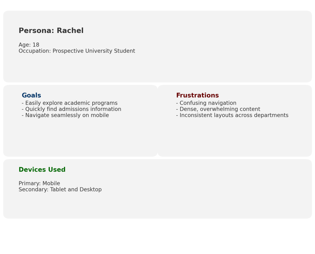
Persona Development
Meet Rachel, a prospective student trying to explore different academic programs while browsing on her phone. She needs an easy-to-navigate, mobile-optimized site that lets her compare programs quickly without having to dig through cluttered pages.
Site Map
To create a logical and intuitive browsing journey, I redesigned the departmental site architecture:
- Clear primary navigation categories
- Fewer clicks to reach program information
- Streamlined content organization tailored to user goals
Lo-fi Sketches
Quick wireframe sketches focused on:
- Simplifying homepage layouts
- Highlighting key actions like “Apply,” “Request Info,” and “View Programs”
- Prioritizing mobile usability and content hierarchy
Lo-fi Prototypes
Low-fidelity clickable prototypes allowed internal teams to experience the new page flows, test basic navigation, and offer early-stage feedback before high-fidelity design
Usability study: findings
Two rounds of internal stakeholder reviews helped refine the designs:
1
Users preferred simplified menus over mega-menus for departments.
2
Stakeholders emphasized the need for easy program and faculty directory access.
3
Mobile navigation required additional refinements for faster access to critical content.
Accessibility Considerations
1
Applied high-contrast color schemes and readable font sizes.
2
Designed navigation for keyboard-only users and screen readers.
3
Structured headings semantically for screen reader compatibility.
Takeaways
✓
Impact:
The redesigned templates greatly improved user engagement. Departments found it easier to manage their content, users spent more time on key pages, and the university benefited from a more cohesive and professional online presence..
One quote from stakeholder feedback:
“The redesign made such a difference . Everything feels more connected and easier to use now, especially on mobile.”
✓
What I learned:
This project reinforced the importance of designing flexibly within CMS constraints and balancing user needs with organizational requirements. It also deepened my commitment to baking accessibility into every stage of the design process.
 Tatyanna.design